ShopDreamUp AI ArtDreamUp

Deviation Actions


Description
Image size
2188x2076px 916.82 KB
Comments5
Join the community to add your comment. Already a deviant? Log In
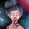
This piece really drew me in when I first looked at it, they key part of the artwork where my eyes were first drawn into were the figures eyes, well closed eyes XD. I really like how you have made good use of the highlights underneath the eyes , especially on the right hand side because this really helps in drawing the viewers eye into the centre of the painting.
Overall the mood of this picture is very dark which I'm certain is the mood you were trying to capture so you have done a very good job there. i understand why you have opted for choosing dark colours because that is a nice easy way to create a darker mood. However if I was to offer some advice with the choice of colours I would perhaps suggest including a greater amount of contrast in some areas. For example I think so me of the colours in the background could perhaps be a bit bolder because in my opinion the limited range of colours does cut down on the image's visual impact a little bit. That being said though I do like how you have blended the colours together well and as I mentioned earlier the highlighting underneath the figures eyes works especially well in attracting the viewers attention onto the models face.
In terms of technique I do not really feel that I can criticise here because you've executed the piece well with all the proportions being correct and the shading also appears to be right. I'd also like to congratulate you on how you've bordered the picture if that is the correct way of putting it. I think the rough outline works really really really well in finishing off the mood of the image and I think that is such a clever idea.
Overall I think this piece has been completed to a high standard and although it is difficult to judge from the photos it appears to be of a decent size so would look at home on most walls. As I've previously mentioned the main improvement i would suggest would be to try and use a wider range of colours to create sharper elemetns of contrast throughout the image.
Overall though very well done!